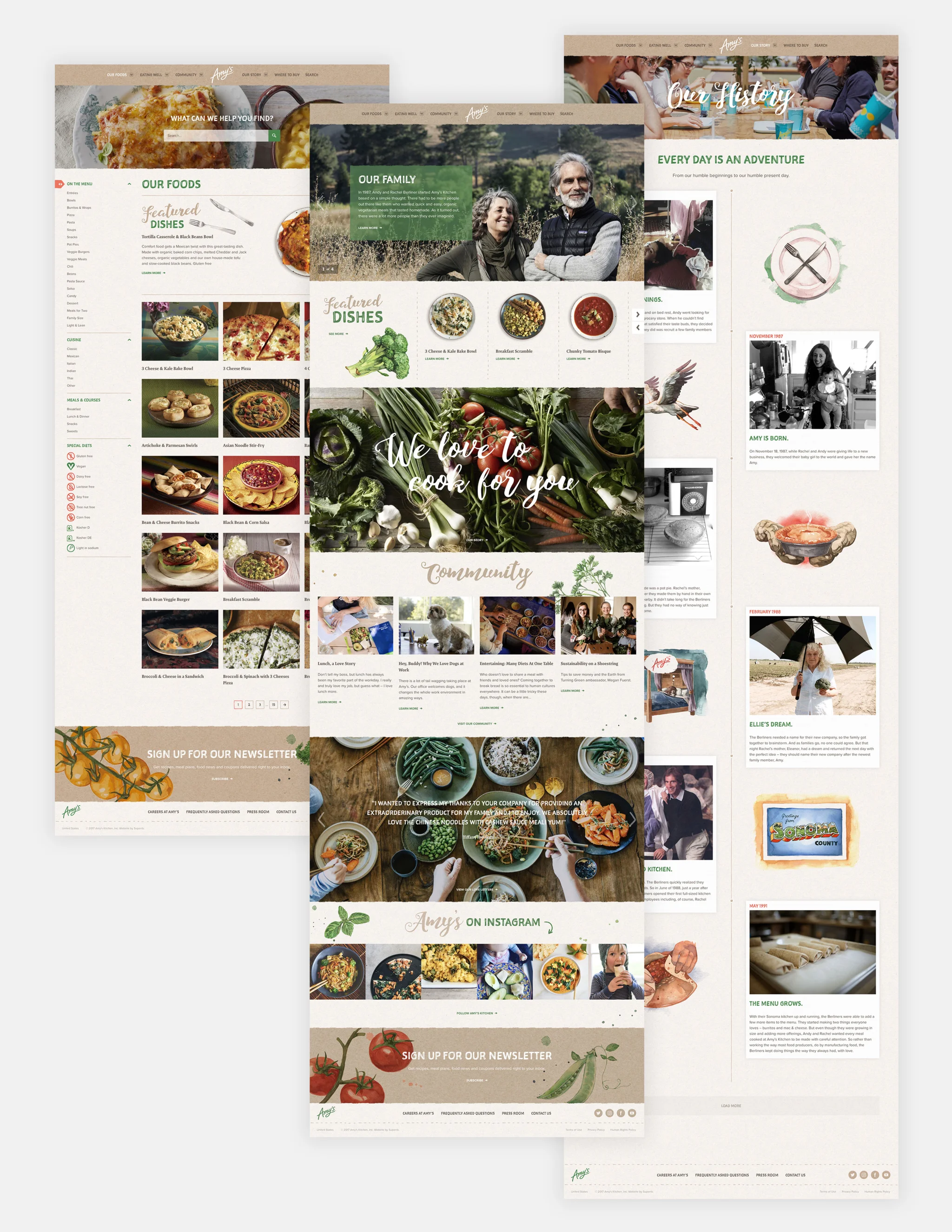
12 months, 79 spreadsheets, 85.6GB worth of page designs, 90 design templates, 682.75 hours of coding, 137 Google Hangouts and four flights across 34,000 kilometers later and Amys.com was born.
12 months, 79 spreadsheets, 85.6GB worth of page designs, 90 design templates, 682.75 hours of coding, 137 Google Hangouts and four flights across 34,000 kilometers later and Amys.com was born.
Find out how we did it here.
This post reflects on our working process, looks at the elements which helped to make the project a success and most importantly what we learnt along the way.
If you work in web design, whether you're a junior developer just starting out, an experienced account manager or a designer, we hope this post gives you some useful tips for your own work.
Just a heads up - there’s a little bit of technical stuff in section two. Feel free to skip that part if that’s not your thing!
Using texture for a change
We started the design process with two differing concepts, one of which was a clean, vibrant design and the other is the rich, textural site you see today. We might be slightly biased but we think the result is perfectly suited to the Amy’s Kitchen brand.
In a world where branding and websites are becoming simpler and flatter, it was really refreshing to work on something like this. Of course, it’s not without it’s challenges.
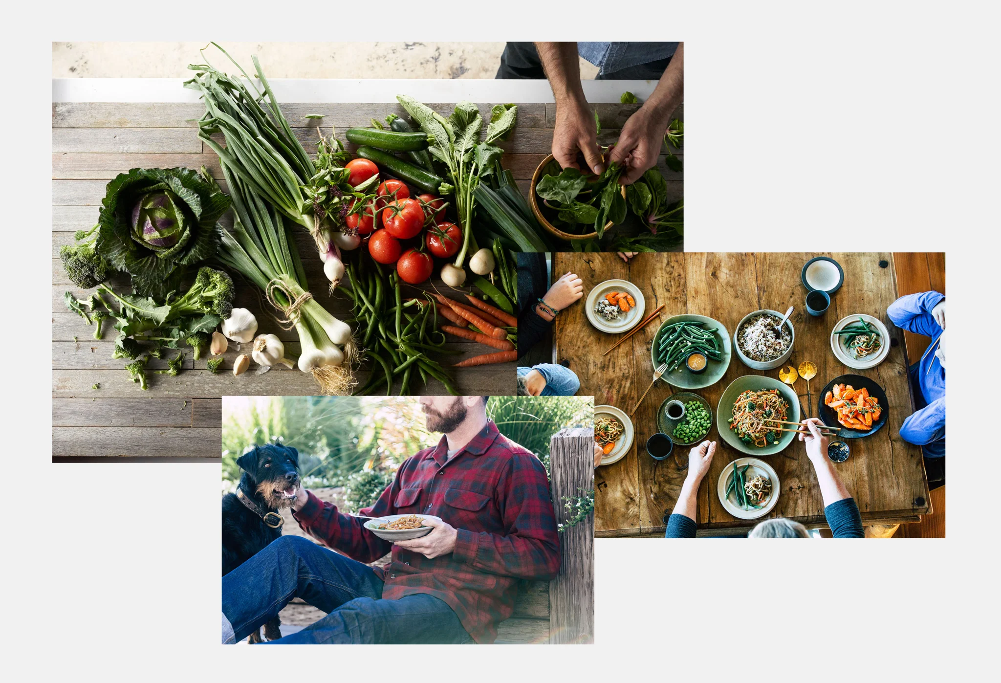
The site is filled with textures, illustrations, tatty edges and subtle transitions. And to top it off, edge to edge imagery. This meant that the design team were working on files with up to 90 layers, which every designer will appreciate is fiddly work to say the least.
It also meant that the size of the pages were huge. For example the PSD file for the Our Story page alone was 500MB. And a certain amount of patience is required when it comes to loading and saving files of that size! Page size was also something that the development team had to consider for the build.
Big pages = slow page load = bad user experience = poor search ranking
If your page load time is slow, it will likely have a negative impact on your site’s search ranking as well as annoying your user. So from the outset the developers made some decisions that would enable us to use awesome visual assets, whilst keeping the page sizes as small as possible.
Srcset and Sizes
Using markup to serve the images throughout the site with accurate calculations for device breakpoints, allowed us to keep the images crisp without overcompensating at any stage.
Webp images
Webp is an image format developed by Google. Unfortunately, it’s support is limited only to Chrome at present. The saving it offers in size, however, makes it very appealing. To take full advantage of the technology, one of our developers wrote a nice little webp SASS mixin. This, combined with an automatic conversion of static assets from png to webp in the gulp compilation allowed us to easily and efficiently reference webp images that could fall back to their original PNG counterparts in the browsers that don’t support webp.
SVG’s
There’s nothing new here but using SVG’s wherever possible meant that we could save on file size with zero quality loss.
Lazy load
We opted not to auto-rotate any of our banners. Auto-rotating banners are generally seen as going against best practise guidelines. However another reason not to use them is that you can leave the secondary images unloaded until requested, saving on unnecessary image downloads.
Crunch it
During the design phase, we chose a style of illustration which allowed us to crunch the transparent PNG’s with aggressive compression whilst avoiding any visible degradation.

Size isn’t everything (but it counts for a lot when it comes to websites)
As Amy’s has a great deal of content to share with its community, it meant that we had over 90 different page designs and layouts. The client is based in San Francisco, so we presented them via Google Hangouts. We have a lot of overseas clients and this normally works well for us.
However with a site of this size, it was ambitious of us to expect people to be able to maintain focus and critically asses the page designs effectively for hours on end, as after 3 - 4 hours people were feeling pretty burned out! In future we’d probably stagger this process. For example we could have presented the core page designs first of all to get initial feedback. Then we could have presented a selection of designs relating to one specific section or feature in subsequent sessions. The staggered approach would mean we could take more time going through each section and that we could get detailed feedback from the key stakeholders in the business who would ultimately own this section of the site after launch.
Managing a long project in an ever changing industry
In the digital industry what is considered to be best practice is constantly changing. Big website projects can sometimes be affected by this because opinions on specific features may change part way through the process.
We expect a certain level of scope creep with any project, but with so many stakeholders all wanting their sections to be the absolute best they could be, we found it hard to know when to draw the line and push for launch. Fortunately we were given some concrete deadlines we had to hit in terms of a launch date, therefore it made it easier to justify moving some items to phase 2 without anyone feeling left out.
We try to use an agile methodology when it comes to developing big sites, but nailing down the minimum viable product (MVP) was the tricky part of this project as we were trying to recreate and improve on all the existing functionality of the old website, as well as build in a whole load of new features as well.
Once live this agile approach helped us to keep things moving and enables us and Amy's to monitor how the site is used before deciding what features should be changed, removed or added.
In hindsight it would have been great to have had more time for the spec phase, however that's almost always the case and you have to deal with the realities of time and budget constraints. A perfectly written spec is the holy grail, however if there's no money left for the actual build then it's pretty pointless!
500 internal communication meltdown: How to avoid it
The size of Amy’s as an organisation is also bigger than a lot of the companies we work with. To put it into perspective for those of you that aren’t familiar with the brand, Amy’s has over 2,400 employees and makes 72,000 cases of product and 160,000 hand rolled burritos every day. The burritos are definitely worth trying if you’re into your mexican food!
This meant the project was hugely collaborative. Nearly every member of the Superrb team worked on it at some point or another and there was at least 12 other individuals involved on the client side too. Therefore clear lines of communication were key to avoiding office meltdowns.
The fact that the UK is 8 hours ahead of San Francisco, actually worked in our favour in some ways. One of the things we found really useful was being able to work on the site when the clients were asleep. It meant that they could review our work during their working day and provide feedback for us to crack on with the following day, naturally creating a productive workflow.
We also used a few Google tools which helped us to keep the momentum of the project going.
We used Google Sheets to create a content template, populated on an ongoing basis by the client. We incorporated a traffic light system which signaled when content needed reviewing and when it was approved and ready to upload. Although he wouldn’t publicly admit it, our MD secretly loves nothing more than a good spreadsheet. So this made him very happy. Goodbye street cred (he likes to think he had some).
The client shared their images using Google Drive. As photography would often be edited or resized, it was important that anyone populating the site with content could easily identify which was the latest imagery and using Google Drive made this a simple process.
Lastly, we used Google Hangouts to conduct weekly meetings with the team at Amy’s as well as daily check-ins during the final pre launch phase to ensure everything was ready and had been properly tested.
You may already use these apps regularly but if you don’t it’s worth thinking about how they might streamline some of your working processes.

Learning from the client
Keeping track of issues post launch with a big site is something that we learnt a lot about through our work with Amy’s. The Amy’s team developed some internal practises which we would highly recommend to other businesses of the same size.
Betsy, Communications & Collaborations Consultant at Amy's is a Smartsheet wizard and created an internal issue tracker to manage content updates, bugs and new features. Working together we were able to blend this with our internal project management system to minimise admin and to ensure everyone had a handle on what work was going on.
When it came to validation, Michael, Senior Web Developer at Amy’s created a formalised internal QA system and staging process to avoid bugs being uploaded to the live site. We would first develop locally and then pull changes to a staging environment. The client would then check them on the staging environment and when they were happy they’d pull the changes to their own staging environment for wider testing with their team. Finally they’d put the changes live once the updates were signed off.
This wouldn’t necessarily work for smaller organisations or companies with lesser technical support but it was certainly beneficial for those involved in this project.
It would have been difficult to integrate these methods if we didn’t have a close working relationship with the client. And above all, without trying to sound cheesy, that’s what made this project a success.
Hopefully you find these musing useful for your own projects.


